
The spreadsheet can be a great tool to store and maintain data. However, with so much data and information, it can be very overwhelming. Thus, graphs help you to understand complex data in a jiffy. So, if you are wondering how to make a graph in Google Sheets, this blog is for you!
This blog will discuss how to create a graph in Google Sheets.
Table of Content
| Why Are Graphs Used in Google Sheets? How to Create a Graph in Google Sheets? How to Create Different Types of Graphs in Google Sheets? How to Make Line a Graph in Google Sheets – Line Graph How to Make a Graph in Google Sheets – Scatter Plot How to Make a Graph in Google Sheets – Bar or Column Graph How to Make a Graph in Google Sheets – Stacked Bar Graph How to Make a Graph in Google Sheets – Line Graph How to Make a Graph in Google Sheets – 3D Graph Conclusion |
Why are Graphs Used in Google Sheets?
As they transform abstract numbers into visual representations that can be quickly understood, charts and graphs can be very helpful in simplifying complex data. Making charts or graphs out of the numbers in your spreadsheet is simple with Google Sheets.
How to Create a Graph in Google Sheets?
Creating a graph is simple and easy to create. Here’s how to do it –
- Open a Google Sheet and put the data.
- Select the cell to enter the graph.
- In the top toolbar, find the Insert>Chart
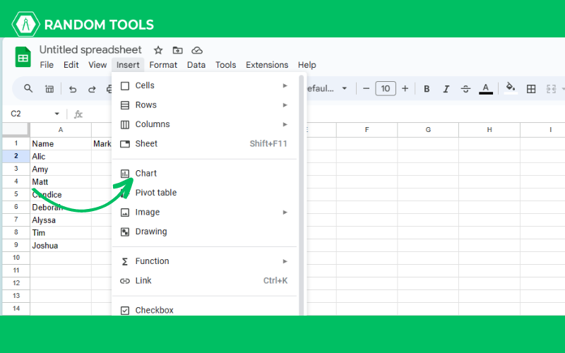
- Your chart will appear on the sheet.

You can customize and select different types of charts and graphs as per your needs.
How to Create Different Types of Graphs in Google Sheets?
Because they transform abstract numbers into visually appealing representations, charts and graphs are useful for conveying information. With Google Sheets, it’s simple to construct graphs or charts from the data in your spreadsheet.
We have discussed how to create different types of graphs in Google Sheets –
How to Make Line a Graph in Google Sheets – Line Graph
The link between two variables—one dependent and one independent variable—is depicted using line graphs. The independent variable is shown along the horizontal or x-axis and is usually used to indicate the passage of time. The y-axis, or vertical dimension, is used to measure the dependent variable. The junctions are shown as dots that are connected by curved or straight lines. Here’s how to make a line graph in Google Sheets –
- Set up your data.
- Go to Insert>Chart.
- A dialogue box will open beside the page, and you can pick or customize your line graph as needed.
How to Make a Graph in Google Sheets – Scatter Plot
In scatter plots, a dataset of two variables is often represented. Data is shown as a set of points, with the values of one variable determining the position along the x-axis and the other variable determining the position along the y-axis. Here’s how you can do it –
- Set up your data.
- Go to Insert>Chart.
- A dialogue box will open beside the page.
- Select Scatter Chart from the box.

- Now, you have your scatter graph on your sheet.
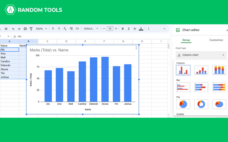
How to Make a Graph in Google Sheets – Bar or Column Graph
Bar graphs and columns are used to compare categorical data. Each bar represents a category. The length of the bar shows the value they represent. The higher or longer the bar, the higher the value. Depending on the data, these graphs are placed either horizontally or vertically. Here’s how to make a bar or column graphs –
- Set up the data in Google Sheets.
- Select the data using CTRL+A.
- Go to Insert>Chart.
- Select the column or bar from under the Chart Type to select a horizontal or vertical bar.
How to Make a Graph in Google Sheets – Stacked Bar Graph
A simple bar graph uses bars to represent a variable. The stacked bar graphs, however, only accomplish this for one variable. The height or length of the resulting stack, which is created when the bars in the bar graphs are stacked on top of one another, displays the total outcome. How to create a stacked bar graph is as follows –
- Select the data using CTRL+A.
- Go to Insert>Chart.
- You will find a dialogue box with chart options.
- Click the drop-down, select Stacked Column Chart, and select Standard from under the Stacking.
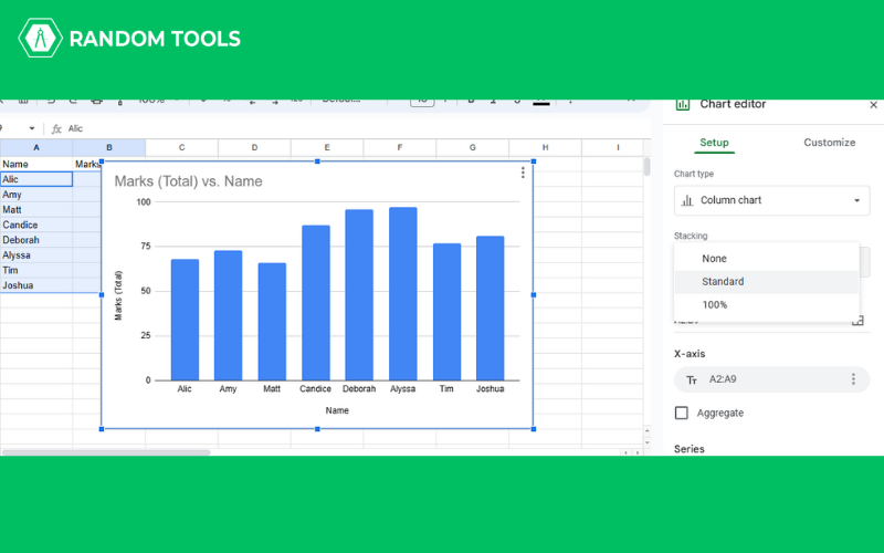
- If you want to use horizontal bars, you can navigate through the same stacking options.
How to Make a Graph in Google Sheets – Line Graph
Line graphs are best for showing one or more variables. The graph has an X and Y axis, in which – the X-axis shows the time unit, whereas the Y-axis shows the unit of the variable. Here’s how to make a line graph in Google Sheets –
- Select the entire data using CTRL+A.
- Go to Insert>Chart.
- A dialogue box named Chart Editor will appear at the side of the page.
- Click on the drop-down option Column Chart.
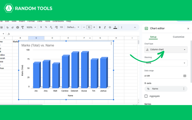
- You will find several line graphs.
- Select the one that suits your data.
Not to forget, did you know you can also make 3D graphs in Google Sheets?
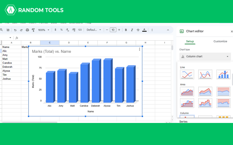
How to Make a Graph in Google Sheets – 3D Graph
Here’s how you to 3D graphs in Google Sheets –
- Select the entire data using CTRL+A.
- Go to Insert>Chart.
- A dialogue box named Chart Editor will appear at the side of the page.
- Click on Customize.
- Click on 3D.
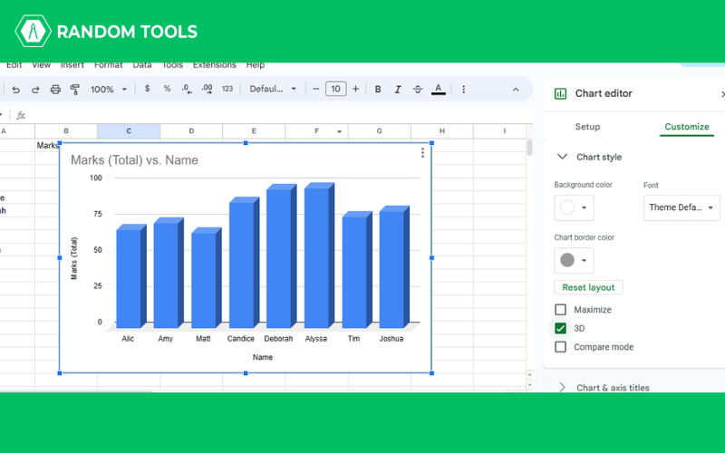
There you go! You have a data chart that looks more presentable and appealing.
Conclusion
Now you know how to make a graph in Google Sheets, you must have known by now that the chart selection includes various graphs. Hence, your chart selection depends on the data you use or want to highlight. Usually, Google Sheets automatically recognize the type of chart suitable for your data type. However, you can choose anything you want to. These are the basics of Google Sheets, and if you want to know more about Google Sheets basics, check out this blog!